We don't redraw your logo and call it a rebrand. We set the visual direction — how the brand looks, reads and feels — so customers place you in a higher category before you say a word.
Brand direction is the hardest thing to fake and the easiest thing to feel. Here's the point of view every project is built on.
People price you by how you look before you speak. We don't work on "pretty" — we work on which category the viewer puts you in within the first two seconds.
Restraint signals confidence. Gold, sparkle and "more of everything" are luxury clichés — and they read cheap. Expensive is what's left after you remove the noise.
One standard across everything beats a loud, mismatched feed. A brand feels expensive when every piece looks like it came from the same source — not when it posts more.
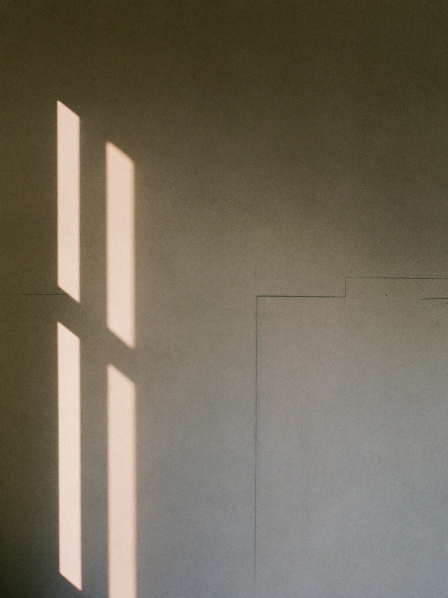
Not effects, not gradients, not colour tricks. A confident typeface, generous spacing and silence around the idea carry more weight than any filter.
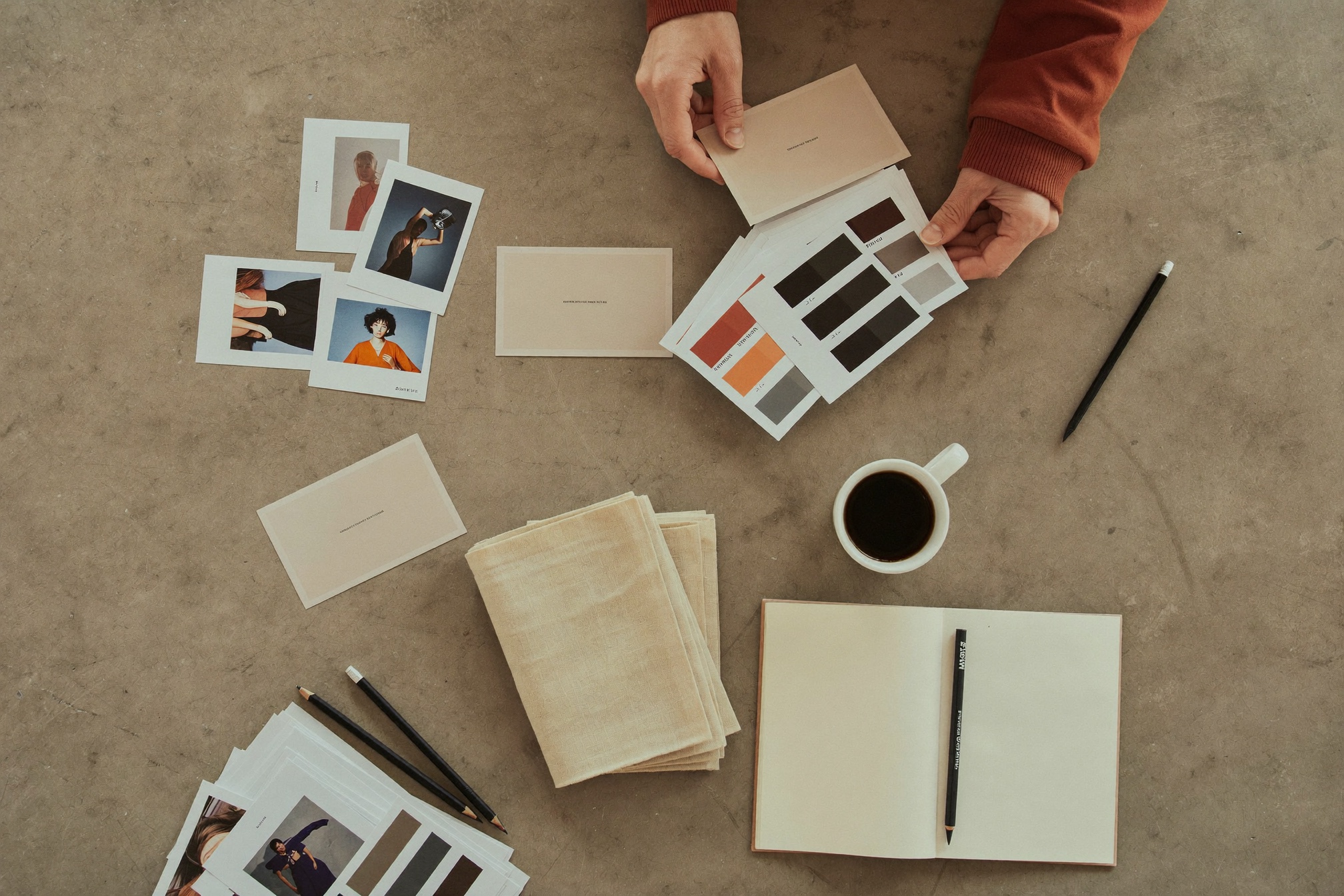
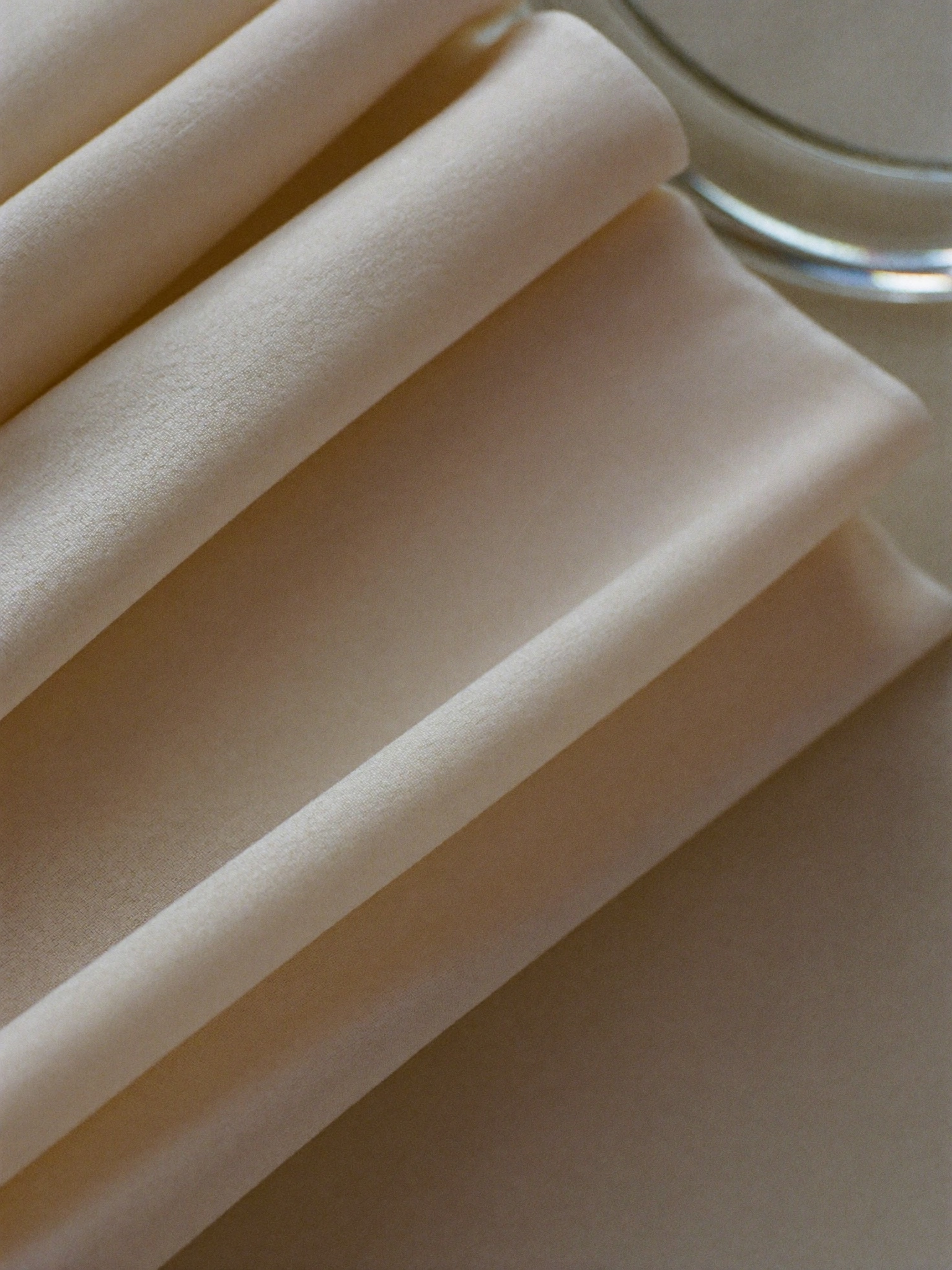
A neutral foundation, accent through texture instead of loud hue, natural light and controlled shadow. No stock gloss. The brand borrows its colour from real materials.
Every brand we direct gets the same backbone: a type system, a controlled palette and a photographic point of view. Consistent inputs, premium output.
Neutrals carry the brand. One accent earns its place. Colour comes from material, not decoration.
Natural light. Controlled shadow. Real materials over stock gloss. This is the kind of imagery a directed brand lives inside.

Reference mood — Jil Sander · Vogue · YSL
Not a slide deck that sits in a drawer. A working system your team can actually use after we hand it off.
The core idea of how the brand looks and feels, written down and shown — not left to interpretation.
A typeface hierarchy and a controlled palette with rules for where and how each is used.
The look, light and framing for every future image — so new content always matches.
Ready-to-use layouts for social, posts and key touchpoints, built on the same standard.
How the brand speaks — direct, confident, no hype — with examples to copy from.
One reference everyone designs against, so the brand stays consistent without us in the room.
Tell us about your business. We'll show you what it could look like.
Start a project